Documentation
Views
The form designer is organized as views to optimize work efficiency
- · by allowing to see all related information at a glance.
- · by assigning as much space as possible to the form representations.

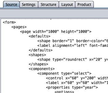
| Source | the form source code in XML format in a text editor. |
| Settings | the settings editor. |
| Structure | the form editor used to design the form structure and functionality. |
| Layout | the 2D form drawing tool used to create the visual form layout. |
| Product | the code generator used to create turnkey code and documentation. |
As a side effect, the distinction of form structure and layout helps to take the blind user's point of view. The structure view invites to expose hierarchical relationships by grouping and nesting of related form elements to assist the blind user in recognizing the form structure.
Basic Form Creation
HTML form creation is straightforward and begins with the design of the form structure and functionality. Then, the HTML form gets visual layout, segmentation, and styling, all done with the 2D form layout tool. Finally, the generated code goes to the server as turnkey application.
was created in the structure view simply by
drag and drop from the toolbar.
and decorated with the 2D form layout tool
in the layout view.
server in the product view.
in the source view.
Available Form Elements
| Text Fields | The text field is provided for single-line text input with optional placeholder and initial input. Input can be set required and its maximum length can be specified. |
|---|---|
| Custom | Input is validated by a custom regular expression. Unicode is supported. A dialog is available to assemble a simple regular expression. |
| Integer | Validates that an integer does not exceed a given numeric range. |
| Number | Validates that a number with decimal places does not exceed a given numeric range. The number of decimal places can be customized. |
| Input is a valid email address. A predefined (customizable) regular expression is used for validation. | |
| URL | Input is a valid URL. A predefined (customizable) regular expression is used for validation. |
| Date | Input is a valid calendar date, optionally within a date range, in a custom date format with custom separators. The date format can be customized in the settings view. The valid date range assigned to can either be a specified interval of days from the current date, a fixed date interval, a fixed start date, or a fixed end date. A custom accessible date picker is available to select a date from a monthly calendar. |
| Password | Input is validated by a custom regular expression. A dialog is available to assemble a simple regular expression. |
| Text Areas | Unicode is supported. |
| Editable | The editable text area is provided for multi-line text input with optional placeholder and initial input. Its maximum length can be limited and input can be set required. |
| Read-only | The read-only text area is provided for multi-line text rendering. |
| Select Components | A select component represents the HTML select control with a menu of options and an initial selection. An empty-value option can be added at the top of the drop-down menu as default selection. |
| Custom | The custom menu options are made from newline-separated custom strings in a text area (either typing or paste). Unicode is supported. |
| Day | The menu options are selected days of the month from 1 to 31. The current day of the month can be used as the default selection. |
| Month | The menu options are selected months of the year from 1 to 12. The current month of the year can be used as the initial selection. |
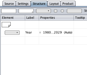
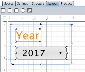
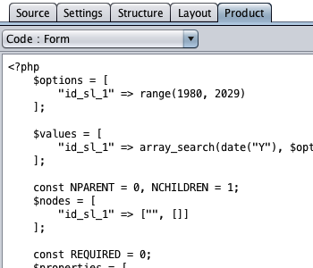
| Year | The menu options are selected years from 1800 to 2199. The current year can be used as the initial selection. |
| Checkbox | The checkbox component represents the HTML checkbox and can act as group (conditional content): if the HTML checkbox is checked, its children will be set enabled with any nesting depth. |
| Radio | The radio component represents the HTML radio button and can act as group (conditional content): if the HTML radio button is selected, its children will be set enabled with any nesting depth. |
| Buttons | Captions support Unicode. |
| Submit | Used to submit the form to the form handler, currently PHP. The action and method attributes can be specified in the settings view. |
| Reset | |
| Custom | A button with no function (waiting for customization). |
| URL | A button used to load a custom URL in a new browser window or tab. |
| Upload | A button used to upload one or multiple files to the form handler. The file-upload button is supplied with a file count indicator. The file indicator's title lists the names of the selected files. The maximum number of files, the maximum file size, and the target directory on the server can be specified in the settings view. |
| Strings | Unicode is supported. |
| String | A string with an optional tooltip (<title>). |
| Link | A string used to represent a HTML link with an optional tooltip. The link attributes can be specified in the settings view. |
| Date | A date string is used to represent the current date in a custom date format with custom separators and with an optional date offset in days. The relative date offset can set a calendar date in the past or future, e.g. for a term of payment. The date format and the date component separators can be customized in the settings view. |
| Container | The string container collects strings with different properties in a multi-line or single-line string container. The string container wraps long strings in a multi-line container. A single-line string is supplied with an alignment property. |
| Groups | The group component represents the HTML <fieldset>. It is used to express hierarchical or sibling relationships for usability (e.g. depth-first form validation) and accessibility. The group component offers group-type autodetection and content-specific validation. |
| Radio | A radio button group is autodetected if the group is made from radio button components. |
| Date | A date group is autodetected if the group is made from three select components that represent a day of the month, a month of the year, and a year. The date format is specified by the order of the date components within the date group. The date group validation first validates its date components and then throws an exception if the given date is invalid. |
| Dates | A dates group is used to compare two or more calendar date inputs against date ranges. The dates group is autodetected if the group is made from at least two date field components, namely, text field components of type date or date groups. The dates group first validates the given calendar dates and then throws an exception if the dates exceed a given date range. |
| An email group is autodetected if the group is made from at least two text field components of type email. The email group validation first validates the given email addresses and throws an exception if the email addresses differ. | |
| Password | A password group is autodetected if the group is made from at least two text field components of type password. The password group validation first validates that the passwords match the given regular expression and throws an exception if the passwords differ. |