Radio
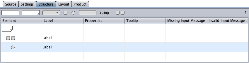
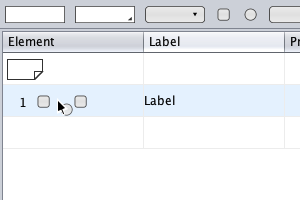
The radio component represents the HTML radio button control with its label. The structure view below shows a radio-button group with an initial radio component as created by drag-and-drop from the toolbar with their element symbols, their labels, and their tooltip cells.
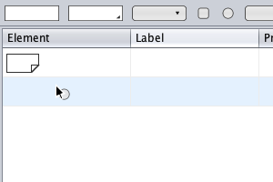
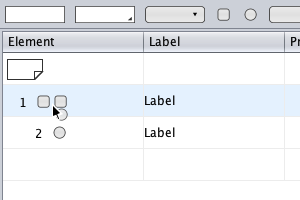
A radio-button group can be created by dragging a radio symbol from the toolbar and dropping it …
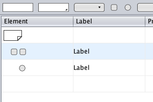
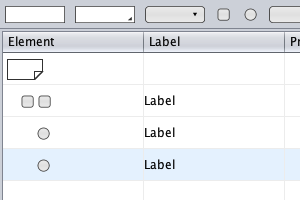
The radio-button group is extended by dragging a radio symbol from the toolbar and dropping it …
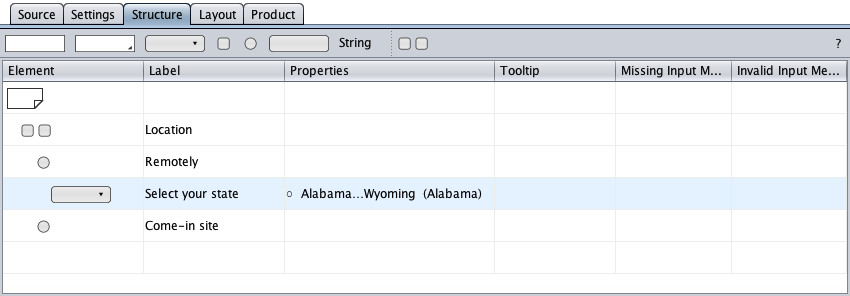
A radio component can have children and behaves then like a group component. Below, a select symbol was dragged-and-dropped on the "Remotely" radio symbol to create a select component as a conditional radio component's child. The corresponding HTML select control (and its label) is disabled if the HTML radio button is not checked. This feature requires JavaScript to be enabled in the browser.