Checkbox
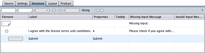
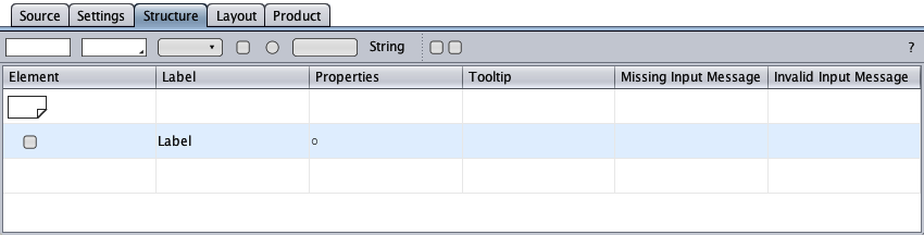
The checkbox component represents the HTML checkbox control with its label. The structure view below shows the initial checkbox component as created by drag-and-drop from the toolbar with its element symbol, its label, its properties, and its tooltip and message cells.
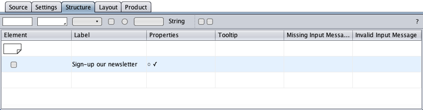
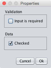
The available properties are required input and the prechecked HTML checkbox control.
A double-click on the checkbox component's 'properties cell opens the properties dialog. The dialog below reproduces the properties from above.
A checkbox component can have children and behaves then like a group component. Below, a button symbol was dragged-and-dropped on the checkbox symbol to create a button component as a conditional checkbox's child. The corresponding HTML submit button is disabled if the HTML checkbox is not checked. This feature requires JavaScript to be enabled in the browser.