Structure
The structure view is the form editor. It consists of a toolbar of form element symbols and a table of form components in a form page as component container. Below is the initial structure.
A form component has a form element symbol, a label, properties, a tooltip, and error messages. Available are:


The form editor is used to add form components to the form, to set the labels, properties, and error messages, and to arrange the order and the hierarchical relationships of the form components.
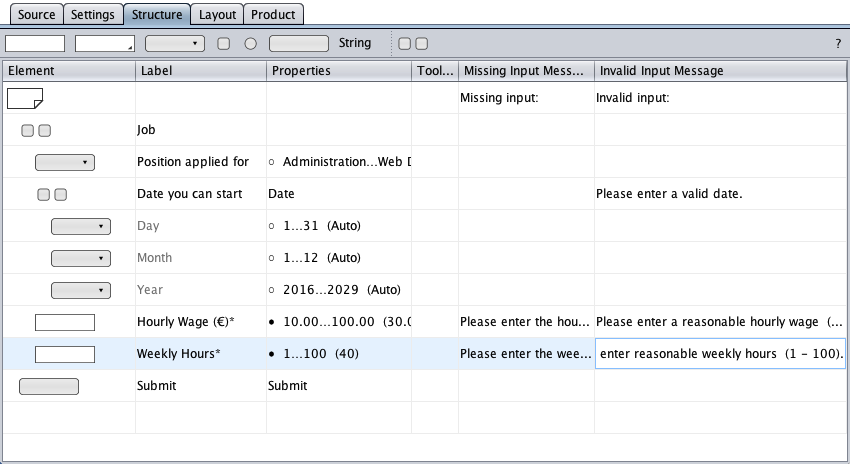
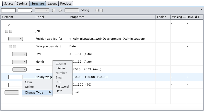
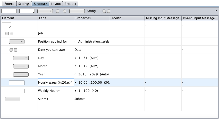
Below is a snippet from the job application form with a "Position applied for" select component, a date group, two text field components, and a submit button. Group nesting ("Job" group) is used to improve accessibility. The black dots in the message columns indicate where error message text is required.
The structure view represents nothing else than the accessible form. Exposing a HTML form's hierarchical nature makes the form a bit more accessible for the blind user and a bit less obtrusive. The regular user's experience is enhanced by visual form layout (segmentation and decoration) in the layout view.
The column widths can be resized by dragging the line between two column headers.
A new form component can be added by drag-and-drop of its symbol from the toolbar onto the "Element" column area. The components' indices are displayed during the drag.
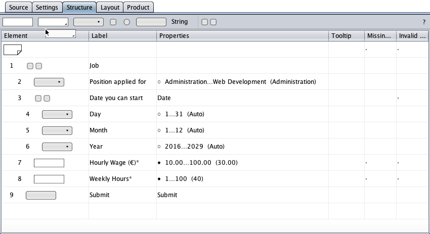
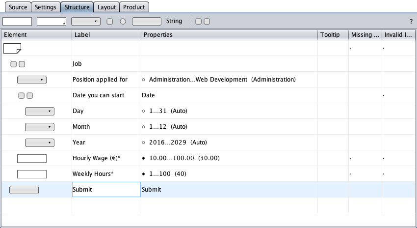
The "Weekly Hours*" text field above has the index 8 and would get the consistent id/name id_tf_8 in the HTML form across HTML, PHP, JavaScript, CSS, and MySQL.
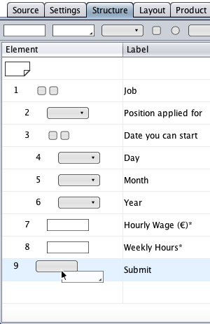
The new component's target row depends on the drop row and on the vertical mouse position within the drop row. Below, the new component would become …

Once a component exists in the form, it can be cloned, deleted, or modified via the (right-mouse-click on the element symbol).
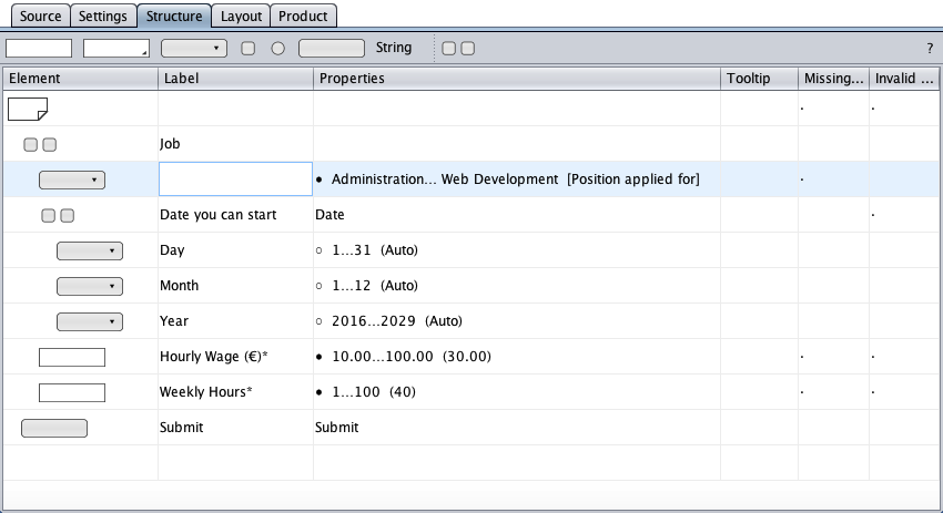
The form components have labels (a button's label is its caption). A double-click on a label cell opens the component's label editor.
Labels can be deleted and replaced if the component offers a placeholder or an empty-value option. The empty-value option below is displayed in square brackets in the properties cell.
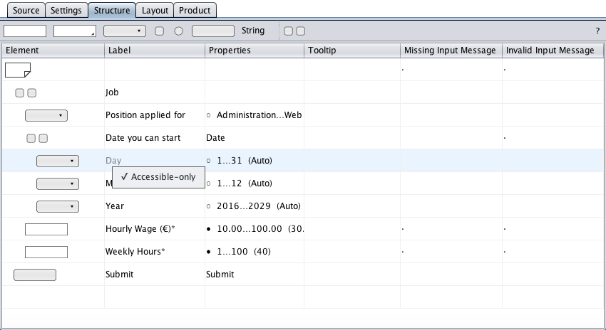
If a label is not needed by a regular user, it can be omitted in the regular HTML form. A right-mouse click on the group label cell opens the label's context menu and a click on the "Accessible-only" menu item toggles the label's rendering. The graying instructs the code generator to supply only the accessible HTML form with the label.
Unicode is supported. Below, the Euro sign was entered using the Unicode \u20ac (hexadecimal code point 20ac with a preceding \u). It would be turned into € in the HTML form. Unicode text can be pasted from the system clipboard (MacOS: Ctrl+…) or simply dragged and dropped from a web site: 世界你好 !
The properties cells display component-specific properties. A double-click on a properties cell (with content) opens a properties dialog.
Tooltips represent the text of the HTML title attribute (W3C).
Error messages consist of a message header and a component-owned message text. The headers for missing input and invalid input messages are specified in the page component. A sample validation of the job application form shows error messages in action.