Dates Group
Overview
A dates group is used to enter two or more calendar dates within one (or several) given range(s). The dates group's children are either text fields of type date or date groups. On HTML form validation, the dates group expects valid calendar dates as input, compares them against the date ranges, and throws an exception if dates exceed a date range. Have look at the event form sample to see a dates group in action.
The below dates group was created from date text fields. The date span of 1…7 days ensures that the departure date is at least one day and not more than 14 days after the arrival date.
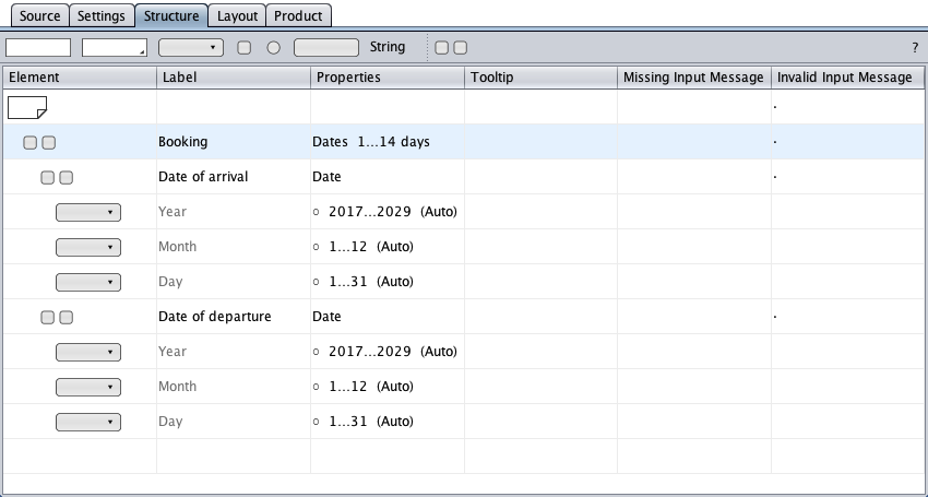
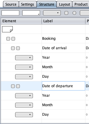
The below dates group was created from groups. The date groups consist of select components of types day, month, and year, in any order.
Dates Group Creation
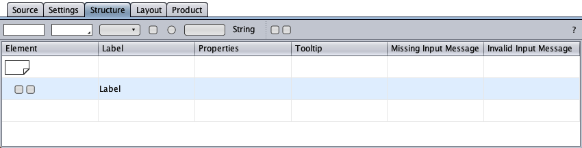
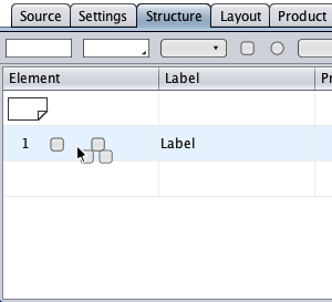
The creation of the dates group is straightforward and begins with an empty group.
Creation from Date Text Fields
First, a textfield component symbol is dragged from the toolbar and dropped onto the empty group's symbol to become a group member. Then another textfield component is added analogously.
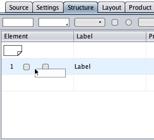
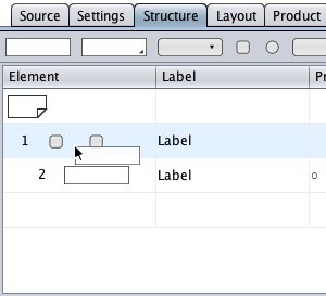
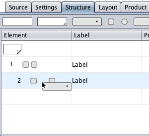
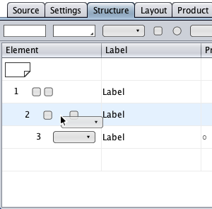
The group turns into a dates group if the types of both textfields are turned into Date via the context menu. Finally, the labels need to be changed.
Creation from Date Groups
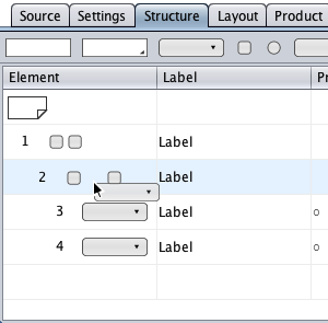
Drag and drop a group symbol from the toolbar and drop it onto the initial group's symbol. Then drag and drop a select component symbol onto the nested group's symbol.
The last procedure is repeated twice to have a nested group with three select components as group children.
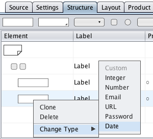
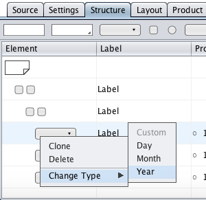
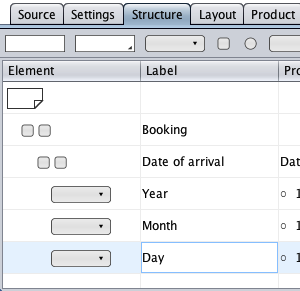
The select component types need to be changed to date types year, month of year, and day of month (or in any other order) from the context menu. The labels have to be changed accordingly.
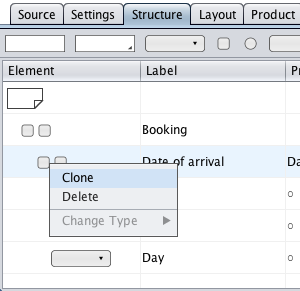
Right-click the "Date of arrival" group symbol and clone the group. Finally, change the cloned group's label.
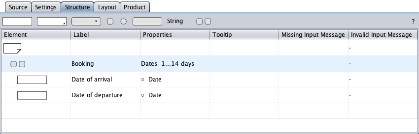
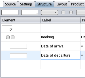
A Room Booking Sample
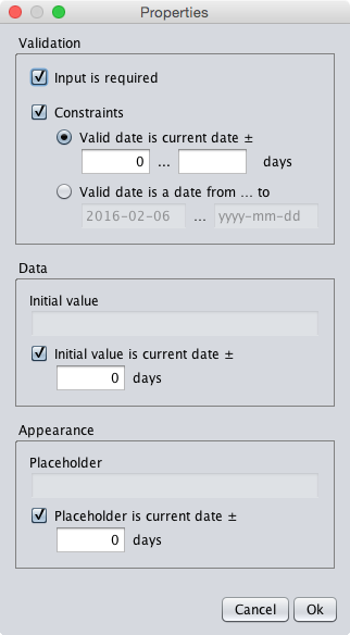
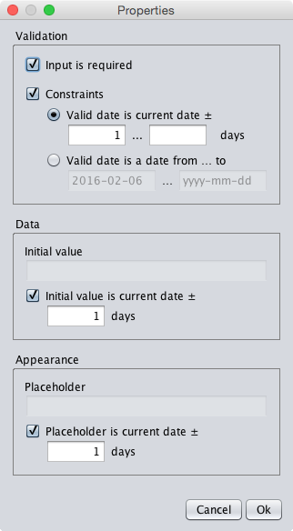
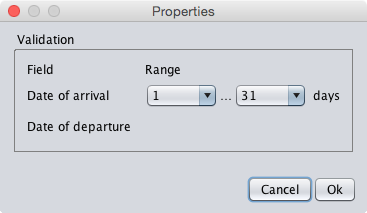
The below sample could be a part of a room booking form. The dates group "Booking" limits the length of stay to 1 to 31 days. The first date textfield will show the current date both as initial input and as placeholder of the date of arrival. The second date textfiled is used to receive the date of departure, showing the tomorrow's date both as initial input and as placeholder. The user is allowed to enter the current or a future date for the date of arrival, but the date of departure is at least one day and no more than 31 days later.
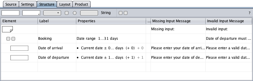
Shown below are the properties dialogs of the date textfields and the dates group that reproduce the settings from above.
as initial input and as placeholder.
as initial input and as placeholder.
as specified in the dates group properties dialog.
A Dates Group with Datepickers
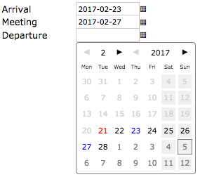
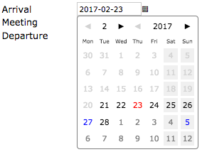
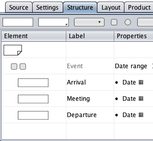
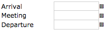
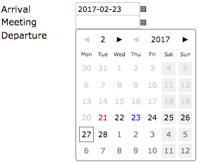
The below form snippet (structure view and browser screenshot) contains a dates group with three date text field controls for an arrival, a meeting, and a departure date. The text field controls have buttons to trigger the datepicker.
A click on the "Arrival" trigger button opens a datepicker that shows the actual date in red. Clicking the February 23 button closes the datepicker and puts this date into the "Arrival" text field according to the date format settings. A click on the "Meeting" trigger button re-opens the datepicker that now tracks the previous selection in blue for usability. Clicking the February 27 button transfers its date to the "Meeting" text field.
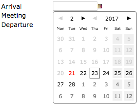
Finally, the "Departure" datepicker is opened to choose the departure for March 5. If the "Arrival" datepicker is used again to change the arrival date, the datepicker covers the text fields below the arrival text field, but tracks the dates selected so far for usability. The previously selected arrival date, February 23, is painted red.