Button
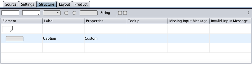
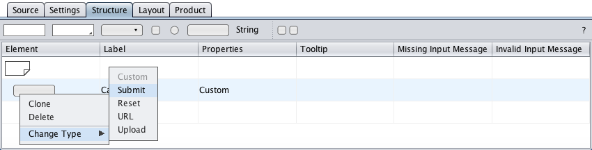
The button component represents the HTML button form element. The structure view below shows the initial button component as created by drag-and-drop from the toolbar with its element symbol, its caption/label, its properties, and its tooltip cell. The component type is specified in the context menu.
Custom
The button component of type "Custom" (default) represents the HTML <input type="button"/> with no function.
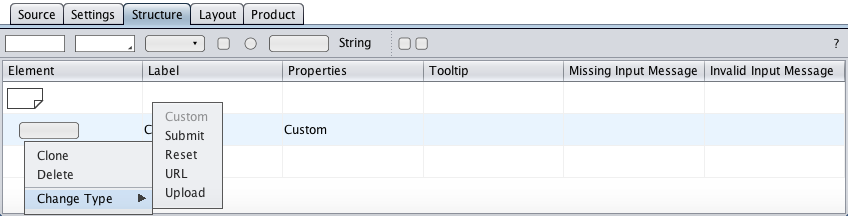
Submit
The button component of type "Submit" represents the HTML submit button.
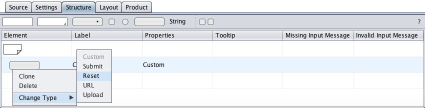
Reset
The button component of type "Reset" represents the HTML reset button.
The reset button is omitted in the accessible form to avoid accidential activation.
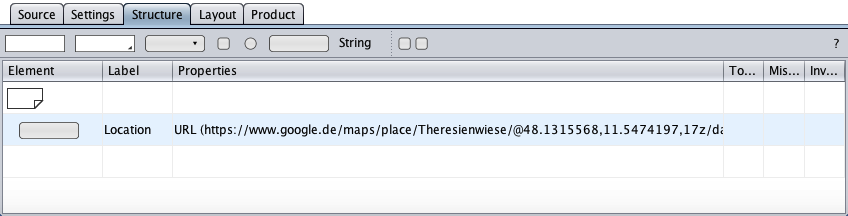
URL
The button component of type "URL" represents the HTML <input type="button"/> used to call javascript:window.open(url) to open a given URL in a new browser tab or window, depending on the user's browser settings.
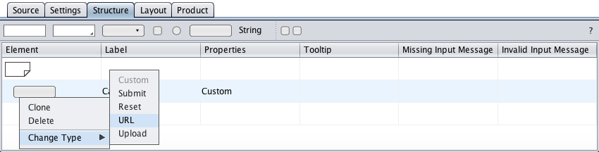
Below is a button to space-savingly offer a Google Maps location, e.g. a meeting point for the Oktoberfest (Theresienwiese).
Upload
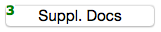
The button component of type "Upload" represents the HTML <input type="file"/> used to upload one ore more files from the user's system to a specified directory on the web server.
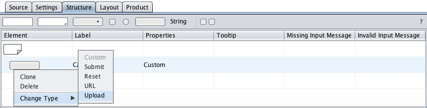
The maximum number of files and the maximum size of a file can be specified in the settings view.
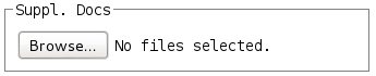
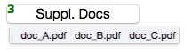
Shown below is the file-upload button's visual feedback to the user.
for file upload.
selection of 3 files.
names of the selected files.
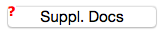
the file selection is lost and a red question mark requests
new file selection from the user.
For the accessible form, the form builder wraps the browser's file-upload functionality in an user-friendlier <fieldset> with the given caption as <legend>. Below is a screenshot from Iceweasel/Debian.