Layout
The layout view is the 2D form layout tool used to arrange the form elements visually, just as any 2D drawing application does with drawing objects on a drawing area. The layout view provides additional geometrical shapes to segment and decorate the form and its elements.
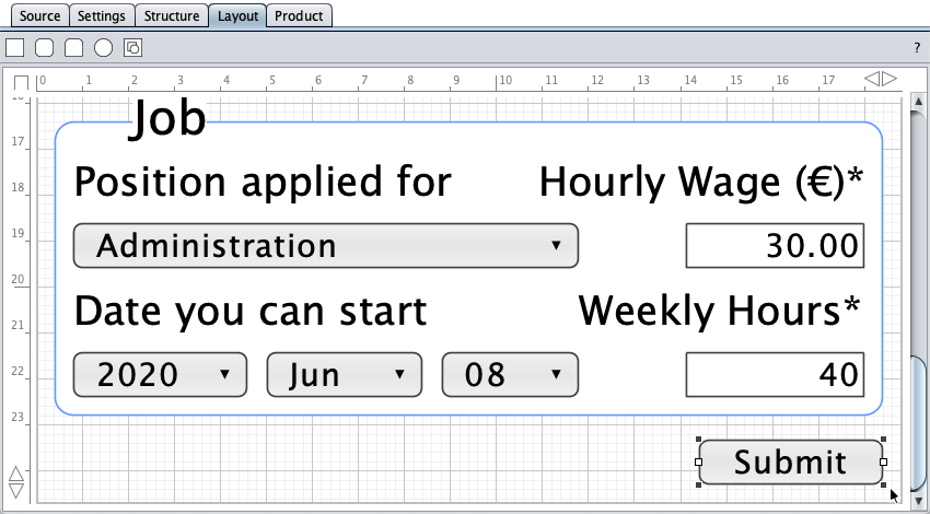
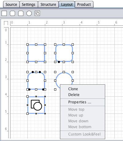
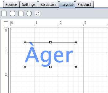
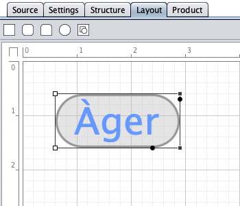
Shown below is the layout view of the job application form with a selected submit button object.
Overview
The form layout tool consists of a toolbar, a drawing area, and rulers with buttons. The grid units correspond to the height of controls. The initial height of labels is 1 unit. The zoom depends on the window size. Shapes are entered by drag-and-drop from the toolbar.
| Shapes | |
|---|---|
 |
Rectangle |
 |
Round-corners rectangle |
 |
Round-corners rectangle, different radius sizes |
 |
Oval |
 |
Image |
| Buttons | |
|---|---|
 |
Toggles the full height/width view mode. |
 |
Decreases/increases the page width by 0.1 units (shift-key pressed: 1 unit). |
 |
Decreases/increases the page height by 0.1 units (shift-key pressed: 1 unit). |
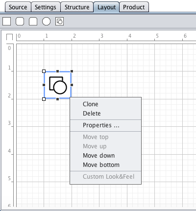
Selection is performed by clicking one or more (with the shift-key pressed) object(s). Alternatively, a lasso rectangle can be dragged around the object(s) to be selected.
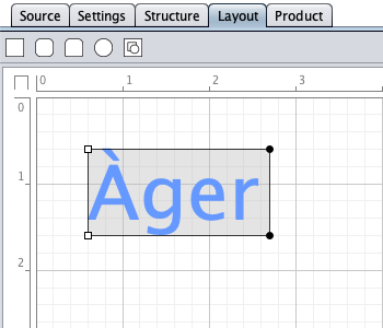
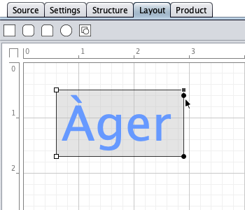
Resizing is done by dragging resize handles (white-background rectangles).
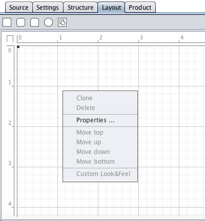
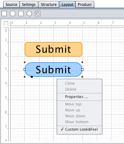
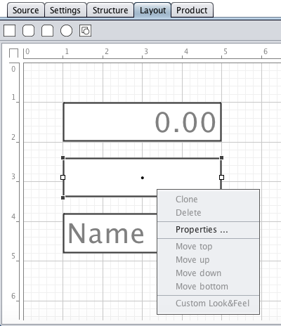
A right-mouse-click on an object or a selection opens the context menu. A double-click opens the properties dialog.
Shapes
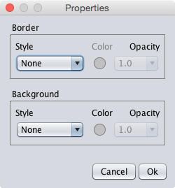
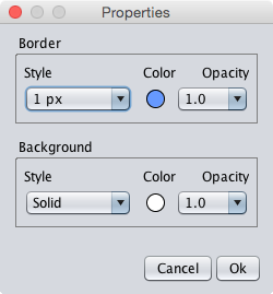
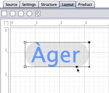
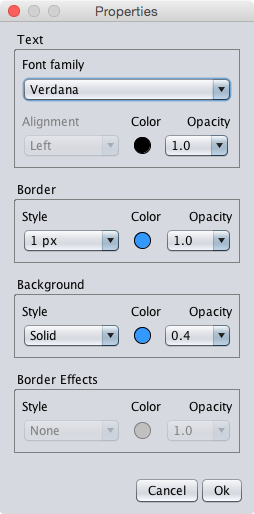
The available shapes with their context menu and properties dialog are presented below. Shapes can be cloned, deleted, or moved in their z-order. Roundness of round-corners rectangles is changed by dragging roundness handles (black circles). The properties dialog allows to specify border and background properties, i.e. style, color, and opacity.
Shapes are turned into <div> in the HTML form by the code generator.
Labels
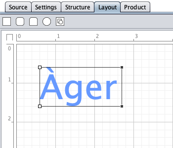
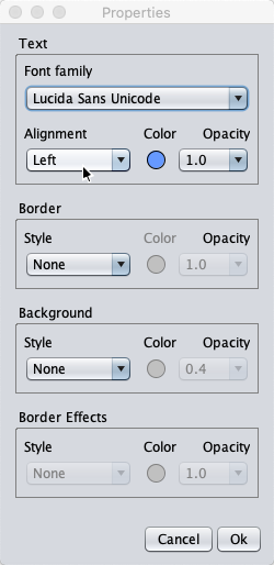
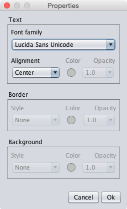
The label height is resizable. Labels have font family, alignment, and text color properties. The alignment is indicated by the horizontal positions of the resize handles. The properties dialog allows to specify font family, border, and background properties, i.e. font family, horizontal alignment, style, color, and opacity.
The font family property prefers Lucida Sans Unicode and, if installed on your machine, Arial and Verdana, and supplies them with CSS font stacks. The other font families on your machine are made available, but not supported with font stacks. The CSS font stacks combine width-compatible physical font families and provide sans-serif as fallback.
font-family:'Lucida Sans Unicode','DejaVu Sans',Verdana,sans-serif;
font-family:Arial,'Helvetica Neue',Helvetica,'Nimbus Sans L','Droid Sans',sans-serif;
font-family:Verdana,Geneva,'DejaVu Sans','Lucida Sans Unicode','Liberation Sans',sans-serif;

Left- and right-aligned labels supply the CSS border and background properties if border or background have been enabled in the label's properties dialog. Roundness and text margin can be changed by dragging padding and roundness handles (black circles).
A label represents <div>phrasing content</div> in the HTML form.
Custom Look&Feel
Currently, buttons can have a custom look with custom caption, border, and background properties. The border roundness is changed by dragging the roundness tracker (black full circle). The code generator creates a <div> with the specified border, border roundness, and background as bottom button layer. The button element itself is rendered as top layer with the specified caption colour, but with transparent border (border-color:rgba(…,0)) and background (background:none).
Text Fields
Text fields have the font family and alignment properties. Text field alignment is indicated by a dot in the layout view if the text field contains no placeholder or initial text. The properties dialog allows to specify the font family and alignment properties.
String Container
A string container wraps long strings in a multi-line string, or collects strings with different properties in a multi-line or horizontally-aligned single-line string. The string container allows to space-savingly aggregate properties in a string in the HTML form, e.g. colors, URLs, calendar dates (fixed or current calendar dates with offsets), and tooltips.
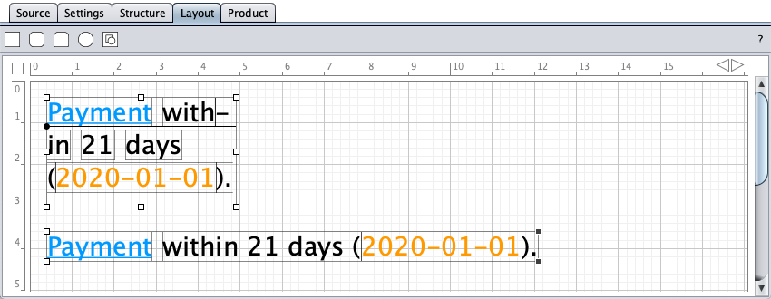
A string container represents <div><div>phrasing content</div> … </div> in the HTML form.
Images
Small images (width/height < 500 px) can be loaded from the system clipboard or from an URL. The "Clipboard" button is disabled if the system clipboard contains no image data. Images can have a custom border and a custom background. Images are inlined as data URI in the CSS. The data URI image format depends on the image content: alpha channels require the PNG format, otherwise, the code generator chooses the format (PNG or JPG) that produces the smaller data.
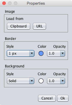
Images are displayed properly (aspect ratio) in the fixed form layout. A future version of the form designer will provide anchors/alignment for fluid and responsive layouts.
Page
The page (both form boundary and canvas) has the border and background properties. A right-mouse click on the grid opens the context menu, a double-click on the grid loads the properties dialog.