Text Area
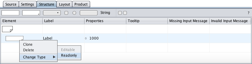
The text area component represents the HTML textarea control with its label. The structure view below shows the initial text area component as created by drag-and-drop from the toolbar with its element symbol, its label, its properties, and its tooltip and message cells. The text area type is specified in the context menu.
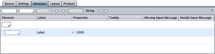
The properties cell's first entry is a flag:
- ○Input is optional.
- ●Input is required.
Editable
The text area of type "Editable" is the default text area type and is provided for multi-line text input.
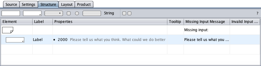
The properties cell of the text area below defines that input is required and must not exceed 2000 characters. The placeholder is rendered grayed. Error messages were created for missing input.
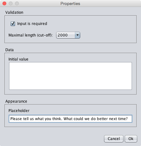
A click on the properties cell opens the properties dialog. The dialog below reproduces the properties from above.
Readonly
The text area of type "Readonly" is provided to display multi-line, read-only text. It represents the HTML textarea control <textarea readonly>.
A double-click on the properties cell opens the properties dialog. The properties dialog is used to enter the text area content, by typing or by paste from the system clipboard.
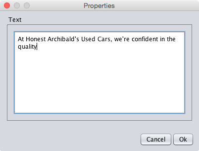
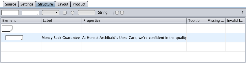
Shown below is the text area component with the updated properties cell and a changed label.