Text Field
The text field component represents the HTML text field control with its label. The structure view below shows the initial text field component as created by drag-and-drop from the toolbar with its element symbol, its label, its properties, and its tooltip and message cells.
The properties shown in the properties cell define how validation is done. By default, text field content is trimmed (leading and trailing blanks removed) before validation.
The properties cell's first entry is a flag:
-
○Input is optional.
-
●Input is required.
-
○Input is optional, trimming is omitted.
-
●Input is required, trimming is omitted.
Text Field Type
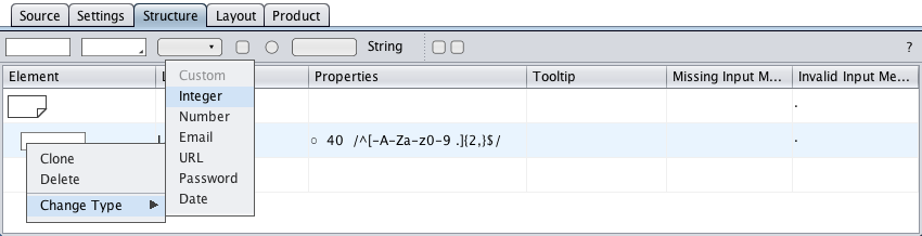
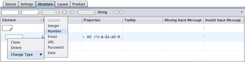
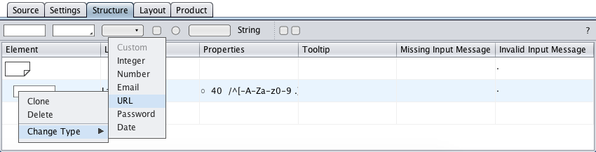
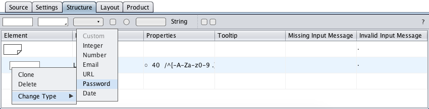
The text field type is specified in the context menu. The following types are available:
-
General text input using a regular expression for validation (default).
-
Input of integers within a given range.
-
Input of numbers (with decimal places) within a given range.
-
Input of email addresses using a regular expression for validation.
-
Input of URLs using a regular expression for validation.
-
Input of passwords using a regular expression for validation.
-
Input of calendar dates, in custom format and optionally within a range.
Custom
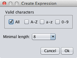
The text field of type "Custom" is the default text field type and is provided for general text input using a regular expression for validation.
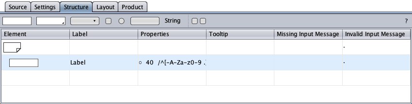
The properties cell of the text field below defines that input is trimmed, is optional, is limited to 40 characters, and it must match the regular expression within the slashes: Input must be at least 2 characters and the valid characters are the dash, uppercase and lowercase ASCII letters, digits 0 - 9, the blank, and the period.
A double-click on the properties cell opens the resizable properties dialog below. The dialog allows to specify the regular expression used for validation. An initial value can be set to propose user input. A placeholder text can be set to guide the user or to replace the label in the styled form.
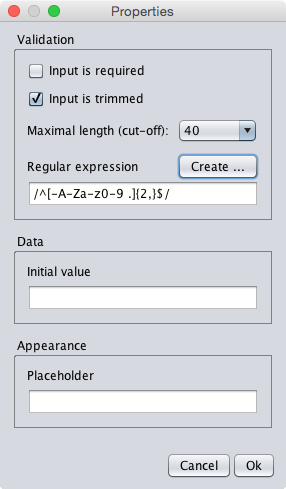
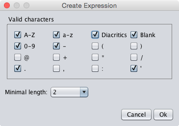
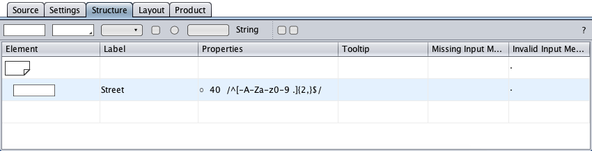
The above settings could be appropriate for the validation of a name: the valid characters are uppercase and lowercase letters including diacritics (non-English letters like ä or à), digits 0 to 9, the blank ("B. J."), the dash ("B.-J."), the period ("B. J."), and the single quote ("O'Doherty"). Input is optional, but if input is given, it must have at least two characters ("Lì" or "L.").
The diacritics option replaces A-Z and a-z with \p{L…}. Input is not validated by JS (EcmaScript 5) if the regular expression allows Unicode.
Integer
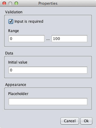
The text field of type "Integer" is provided to enter integers.
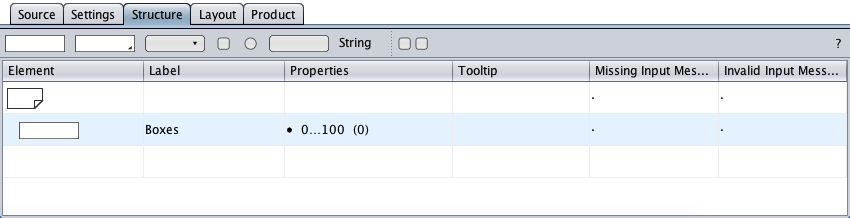
The properties cell of the text field below defines that input is required in the range of 0 to 100. An initial value of 0 has been set (in parentheses).
A double-click on the properties cell opens the resizable properties dialog below. The dialog allows to specify the valid numeric range. An initial value can be set to propose user input. A placeholder text can be set to guide the user or to replace the label in the styled form.
Number
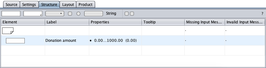
The text field of type "Number" is provided to enter numbers.
The properties cell of the text field below defines that input is required in the range of 0.00 to 1000.00 (at an accuracy of 2 decimal places). An initial value of 0.00 has been set (in parentheses).
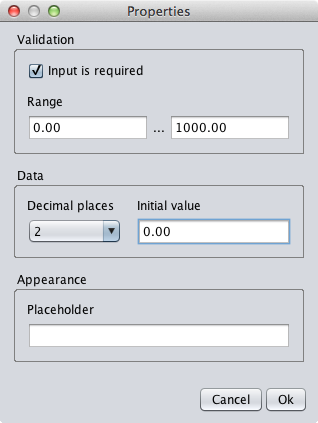
A double-click on the properties cell opens the resizable properties dialog below. The dialog allows to specify the valid numeric range and the number of decimal places rendered in the user's browser. An initial value can be set to propose user input. A placeholder text can be set to guide the user or to replace the label in the styled form.
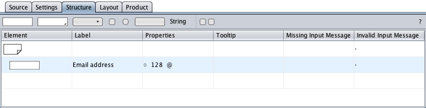
The text field of type "Email" is provided for email address input using a regular expression for validation.

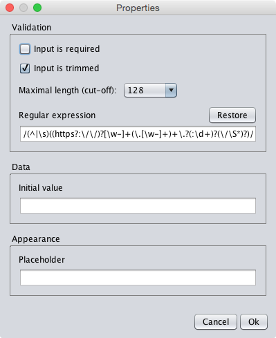
The properties cell of the text field below defines that input is optional, but if input is given, it must not exceed 128 characters and it must match a regular expression, either the builtin or a custom regular expression. The flag @ indicates that the builtin regular expression is used, otherwise, the custom regular expression is displayed in the properties cell for comparison purposes.
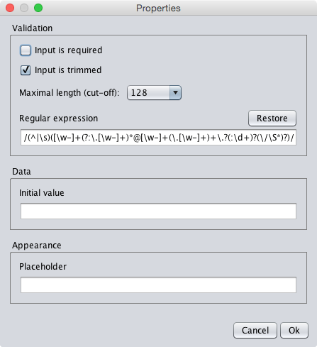
The properties were specified in the resizable properties dialog below (opened by double-clicking the properties cell). The regular expression can be replaced with a better one or restored by clicking the "Restore regular expression" button. An initial value can be set to propose user input or to initiate input. A placeholder text can be set to guide the user or to replace the label in the styled form.
URL
The text field of type "URL" is provided for URL input using a regular expression for validation.
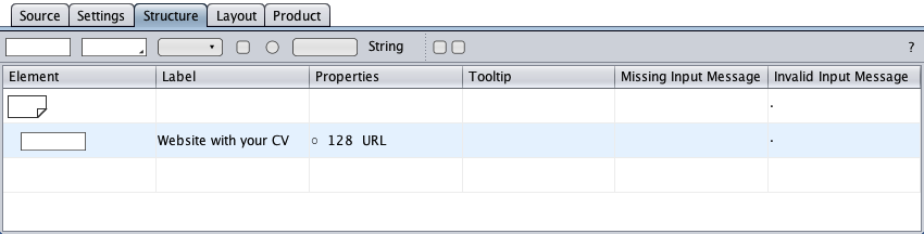
The properties cell of the text field below defines that input is optional, but if input is given, it must not exceed 128 characters and it must match a regular expression, either the builtin or a custom regular expression. The flag URL indicates that the builtin regular expression is used, otherwise, the custom regular expression is displayed in the properties cell for comparison purposes.
The properties were specified in the resizable properties dialog below (opened by double-clicking the properties cell). The regular expression can be replaced with a better one or restored by clicking the "Restore regular expression" button. Sample text entered into the "Regular expression test" field lets play with the regular expression. An initial value can be set to propose user input or to initiate input. A placeholder text can be set to guide the user or to replace the label in the styled form.
Password
The text field of type "Password" is provided for password input using a regular expression for validation.
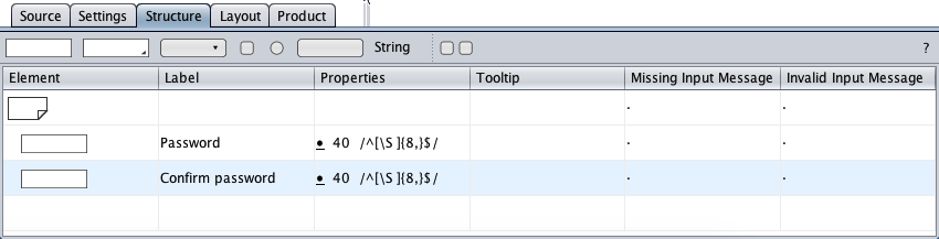
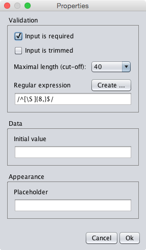
The properties cells of the password field below defines that input is required and must match the regular expression within the slashes: input must be at least 8 characters, and blanks and all characters are valid.
A double-click on a properties cell opens the resizable properties dialog. The dialog allows to specify the regular expression used for validation. An initial value can be set to propose user input or to initiate input. A placeholder text can be set to guide the user or to replace the label in the styled form.
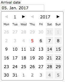
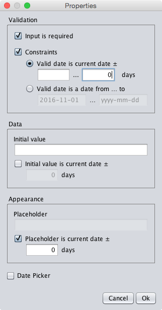
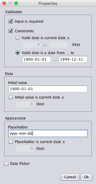
Date
The text field of type "Date" is provided to enter a calendar date, in custom format and optionally within a range, optionally from a date picker displaying a monthly calendar. The date format can be specified in the settings view.

The sample below requests the input of a date within a range of plus 1 to 31 days relative to the current date. The current date plus 1 day (grayed) is the placeholder. Date offsets define relative dates in the future or past (negative number).
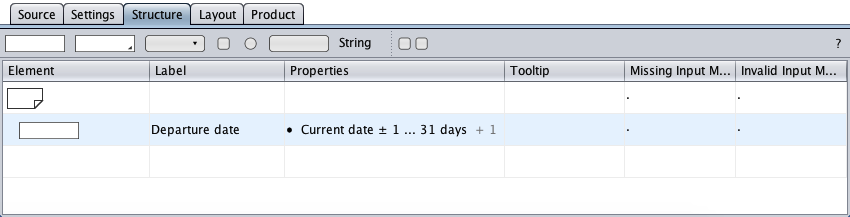
A double-click on the properties cell opens the resizable properties dialog.
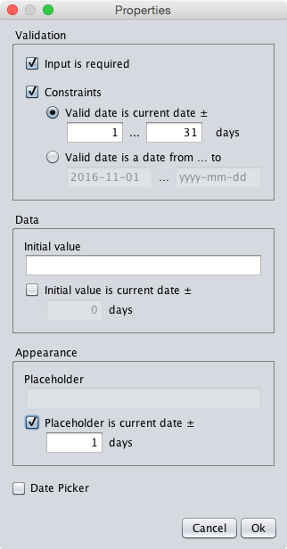
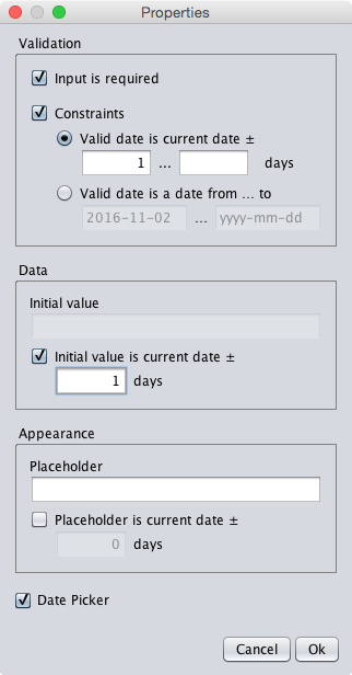
Properties
A constraint can be set to start or end a valid date. A valid range of dates assigned to by the properties dialog can either be a specified interval of days from the current date, a fixed start date, a fixed end date, or a fixed date interval.
The initial value and the placeholder can be custom text or the current date plus an offset in days. The placeholder can be used to guide the user or to replace the label in the styled form.
plus 1…31 days as valid date range.
any date in the past.
valid date.
Date Parsing
If the date format was specified as e.g. "mmm d, yyyy" with short English month names then the user input below …
| Jan 1, 1980 | jan 1 1980 | 1 1 1980 | |
| Jan$%1,$%1980 | jan$%1$%1980 | 1$%1$%1980 |
… would be parsed tolerantly by JavaScript/PHP and turned into "Jan 1, 1980", accepting the months as ordinal numbers for lazy fallback.
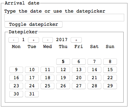
Date Pickers
If the datepicker option was checked in the properties dialog, a click on the HTML date textfield or on a trigger button opens a regular or accessible date picker and enables the user to select a date from a monthly calendar. The date picker is closed by a click on a calendar date or outside of the date picker area. When the date picker is closed after a date selection, the date textfield will show the selected date in the specified date format.