Select
The select component represents the HTML select control with its label. It is provided to select an option from a drop-down menu of options. The structure view below shows the initial select component as created by drag-and-drop from the toolbar with its symbol, its label, its properties, and its tooltip and message cells.
The properties cell's first entry is a flag:
- ○Input is optional.
- ●Input is required.
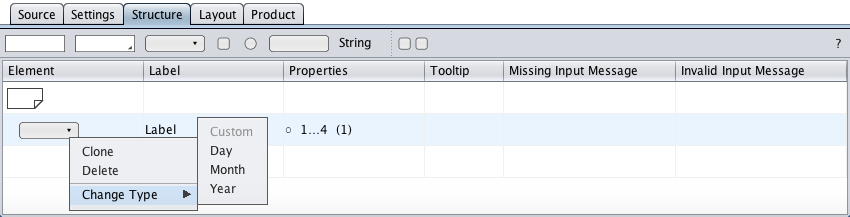
Select Type
-
The drop-down menu is built from custom options.
-
Days-of-month options: numbers in the range of 1 - 31.
-
Months options: numbers in the range of 1 - 12.
-
Years options: numbers in the range of 1800 - 2199.
Custom
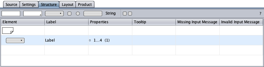
The select component of type "Custom" is provided to select an option from a custom drop-down menu in a select control in a HTML form.
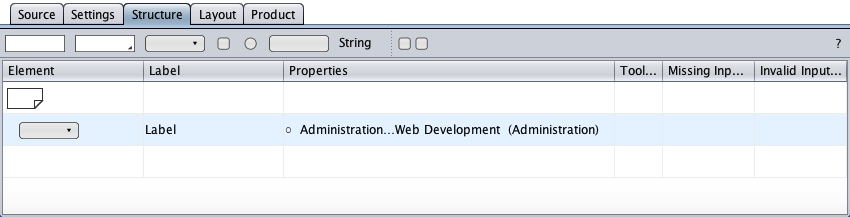
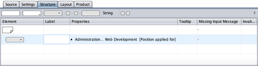
The properties cell of the select component below shows the options menu's first, last, and selected (in parentheses) options.
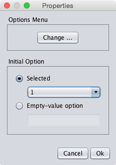
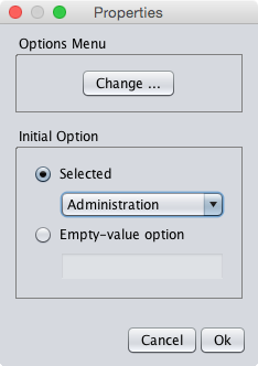
A double-click on the properties cell opens the properties dialog that allows to change the options menu and to specify the initial option. A click on the "Change" button opens the options menu dialog, a multiline text editor, to type new options, to edit existing options, or to paste options from the system clipboard (ctrl-v).
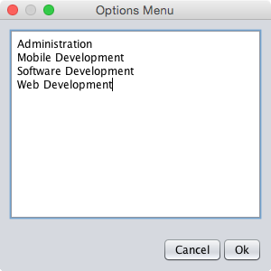
… and the updated properties cell (the initial option in parentheses).
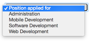
The other initial option is "Empty-value option" which requires the user to select an option. The empty-value option given below is "Position applied for" which is rendered as the HTML select control's top option.
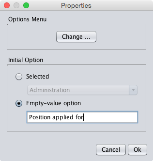
In the properties cell below, the empty-value option is displayed in square parentheses. Since input is required now, a missing input message is requested. The label is possibly obsolete now and could be removed.
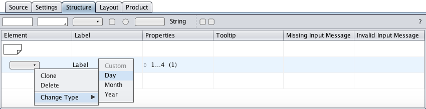
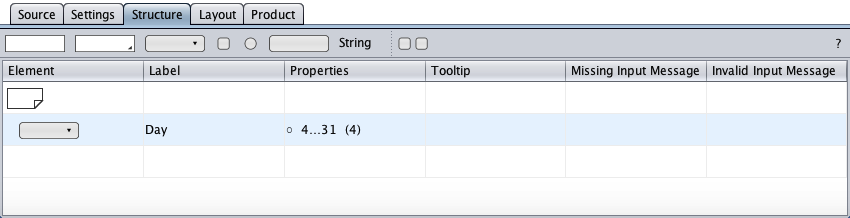
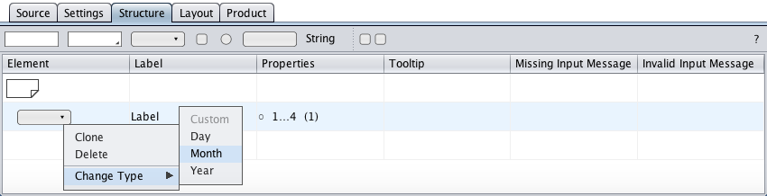
Day
The select component of type "Day" is provided to select a day-of-month from a drop-down menu of days in a select control in a HTML form.
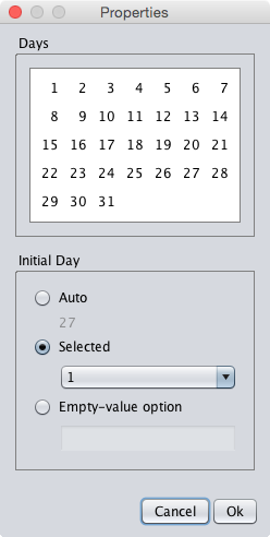
The properties are specified in the properties dialog below (opened by double-clicking the properties cell). The "Days" panel serves to specify the menu of days. The "Initial Day" panel tells which option is initially selected: "Auto" (the current day), "Selected" (one of the days), or "Empty-value option" which requires the user to select a day.
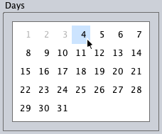
Below is the day select component with the changed day options. The properties shown in the properties cell define a day range of 4 to 31 with the day-of-month 4 as the initial option (in parentheses). The shop is closed on the first 3 days of each month.
Month
The select component of type "Month" is provided to select a month from a drop-down menu of months in a select control in a HTML form.
The properties are specified in the properties dialog below (opened by double-clicking the properties cell). The "Months" panel serves to specify the menu of months. The "Initial month" panel tells which option is initially selected: "Auto" (the current month), "Selected" (one of the months), or "Empty-value option" which requires the user to select a month.
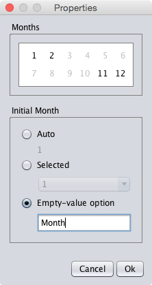
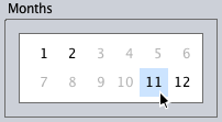
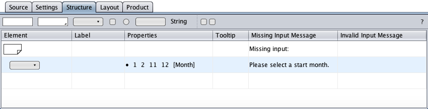
The properties shown in the properties cell below provide the months from november to february for a seasonal job. The empty-value option "Month" (in square parentheses) replaced the label. The filled circle indicates that input is required.
Below is a month select component with a limited set of months for e.g. a seasonal job. The properties shown in the properties cell display the available months the user can select. The empty-value option "Month" (in square parentheses) replaced the label. The empty-value option makes input required (the filled circle) and therefor requests missing input.
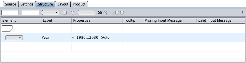
Year
The select component of type "Year" is provided to select a year from a drop-down menu of years in a select control in a HTML form.
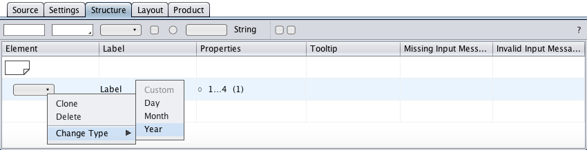
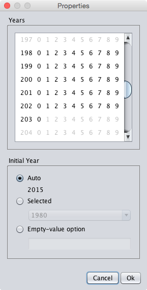
The properties are specified in the properties dialog below (opened by double-clicking the properties cell). The "Years" panel serves to specify the menu of years. The "Initial Year" panel tells which option is initially selected: "Auto" (the current year), "Selected" (one of the years), or "Empty-value option" which requires the user to select a year.
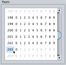
The properties shown in the properties cell below define a year range of 1980 to 2030 with the current year initially selected ("Auto") in the HTML select control (if the corresponding option exists).