Date Group
Overview
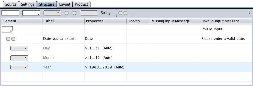
A date group consists of a group component and three select components as group children. The select components represent the day of month, the month, and a year, in any order. On HTML form validation, the date group expects a valid date from valid date components. A select tag's empty-value option or an invalid date will throw an exception.
Creation
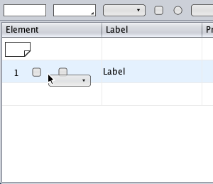
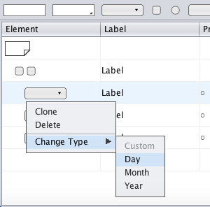
The creation of a date group is started by adding three select components to an empty group, performed by drag-and-drop of the element symbol from the toolbar on the group symbol.
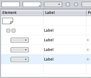
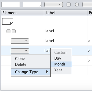
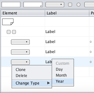
Then the select element types need to be changed to day of month, month of year, and year (or in any other order) from the context menu. Finally, the labels have to be changed accordingly.
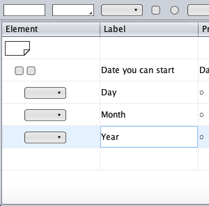
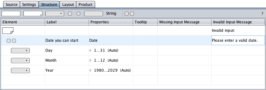
The result is an autodetected date group. It displays the current date as initial date in the HTML form and validates that user input is a valid calendar date.
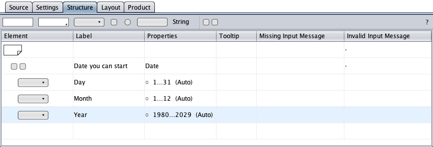
Now having a date group, the page has detected that any of its inputs (the date) can be invalid, and both indicate (by dots) that an error message should be specified, for example "Invalid input:" as the message header and "Please enter a valid date." as the group's message text.
Accessibility
To save space, the select labels can be omitted in the regular HTML form: the current date is the initial date with a semantic 4-digit year in the HTML form, and the day and month select controls have distinct options menus.
The graying indicates that the code generator supplies the accessible HTML form with the select control labels.