Product Settings
Overview
The product settings instruct the code generator how to supply the HTML web form with code, i.e., as client-only or client-server application, optionally with database support, and in a fixed, fluid, or responsive web form layout.
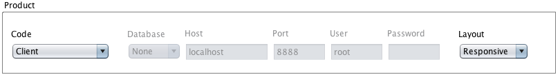
Code
Client
The code generator creates a static web form. Validation is performed by JavaScript.
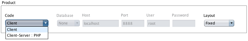
Client-Server
The code generator creates the web form as client-server application, currently PHP only. Validation is done both client and server side. The client-server mode allows to enable database access.
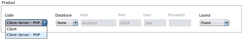
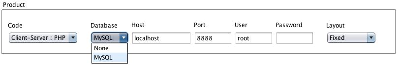
Database
MySQL
When enabled, the code generator creates code to access a database, currently MySQL as a starting point.
Layout
The layout options instruct the code generator to turn the 2D layout into a fixed/static, fluid/liquid, or responsive web form layout.
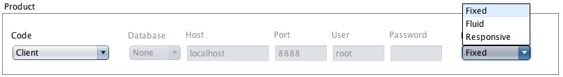
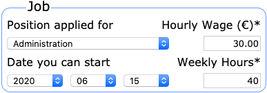
Fixed
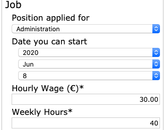
The fixed-width HTML form layout maintains its proportions and does not adapt its width to the form's container width. Below is a fixed-width-layout screenshot snippet from the job application.
Fluid
The fluid HTML form layout adapts its width to the HTML form's container width. In the pictures shown below, the form snippet both in a narrow HTML form container at its fluid minimum width and proportionally stretched (percentage based) in a wide container.
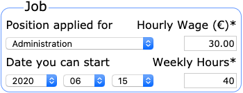
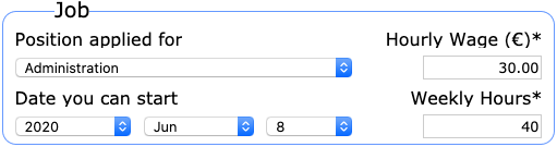
The fluid minimum width is the smallest possible form width without
- collision of form elements: labels keep their proportions.
- clipping of textfield content: the minimum width of a textfield is imposed by a placeholder, by an initial value, or, in the case of a date textfield, by the longest date string possible depending on the given date format.
- substantial clipping of select control content: the minimum width of a select control is imposed by the longest menu or empty-value option.
Responsive
The device-agnostic responsive form layout is the fluid HTML form layout plus degradation. The fluid form layout degrades to an one-column layout if the form container's width falls below the minimum fluid width.
The minimum fluid width is JavaScript coded via an em based reference div. A timer-triggered JavaScript handler continuously checks the form container's actual width and switches to fluid or degraded form layout CSS if required.
The degraded form layout above shows that both blind and regular users benefit from an hierarchical form structure. The degradation dropped the initial form segmentation, but the form builder was still able to turn form element grouping into indentation to enhance the regular user's experience.
The actual implementation of responsive layout is a starting point, not the final solution. A future version of the form builder will turn form structure and segmentation into breakpoints.