Regular and Accessible Datepickers
Overview
The code generator creates dedicated datepickers for regular and accessible HTML forms. Both datepickers use default or localized messages for accessibility and for the title attributes of the datepicker elements. The placeholders below show the default messages. A "Locale ..." button for instant localization will come soon.
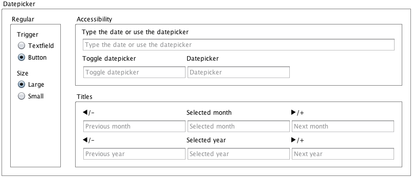
The datepicker settings allow to set the regular datepicker's trigger and size. Two regular datepicker sizes are available, large and small, for the fixed, fluid, and the responsive HTML form layout. Square-shaped touch keys offer finger-friendly touchscreen input. The code generator supplies the degraded form layout with the small datepicker.
Available Datepickers
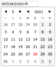
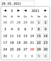
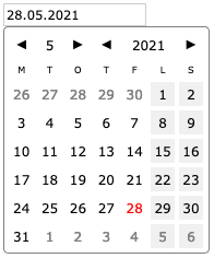
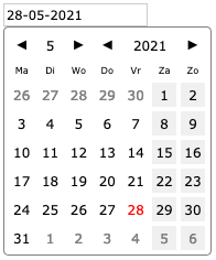
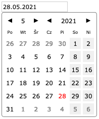
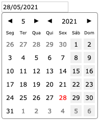
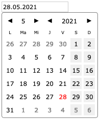
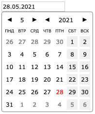
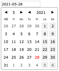
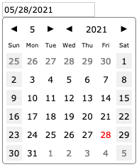
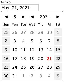
Regular Datepicker
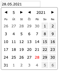
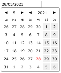
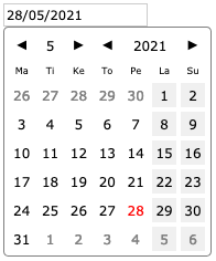
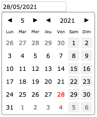
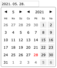
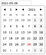
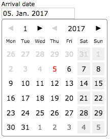
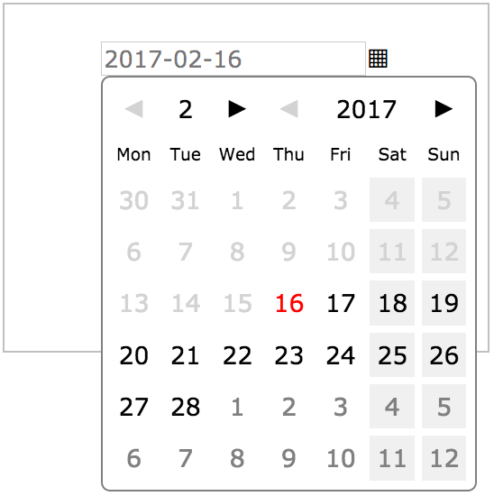
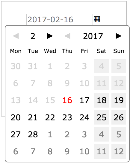
A click on a HTML date textfield or on a trigger button opens a datepicker and enables the user to select a date from a monthly calendar. The names of the days of the week are currently localized for 20 countries. Furthermore, the date settings allow to localize the names of the week days and to set the first day of week (Monday or Sunday). The datepicker is closed by a click on a calendar date or outside of the datepicker area. When the datepicker is closed after a date selection, the date textfield will show the selected date in the specified date format.
textfield.
toggle button.
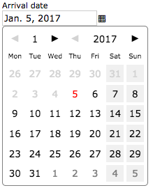
The calendar handles (the arrows) allow to navigate the calendar. A handle is disabled (painted lightgray) if a click on it would exceed a given date range. Dates of adjacent months are painted gray, dates outside of a given range are rendered lightgray with no onclick and hover effects. In the above screenshots, a booking form created a date picker on January 5 as earliest arrival and red-painted current date.
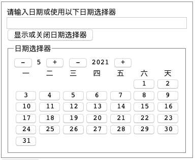
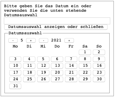
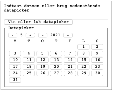
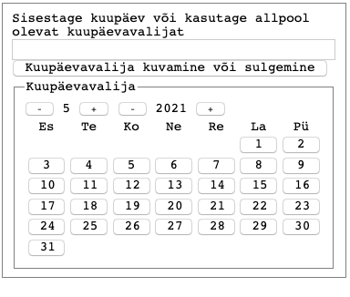
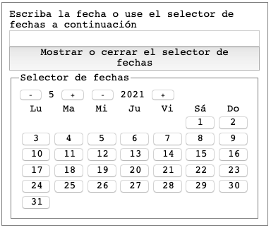
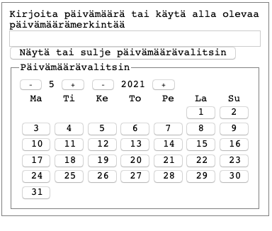
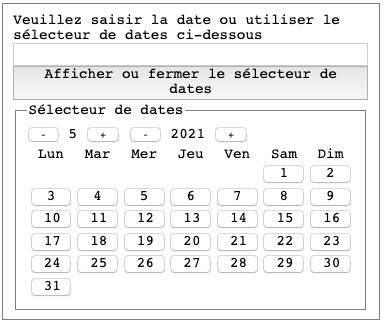
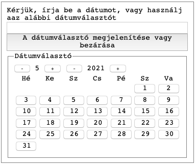
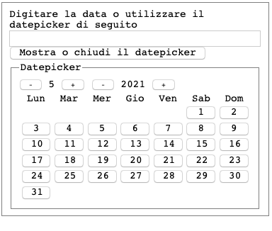
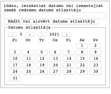
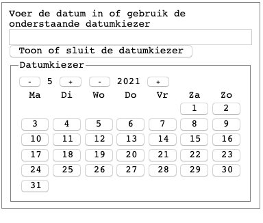
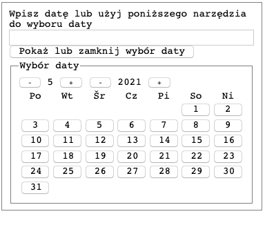
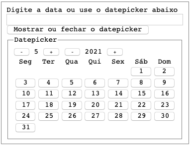
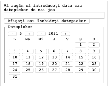
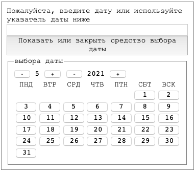
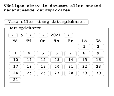
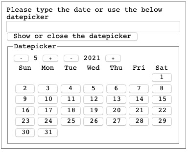
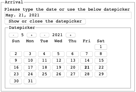
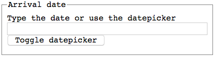
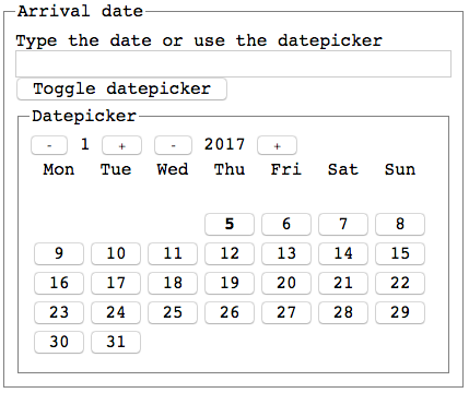
Accessible Datepicker
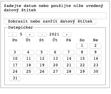
The code generator wraps the accessible date textfield in a <fieldset>, turns the textfield label ("Arrival date" from above) into a <legend>, and adds a datepicker toggle button. The default "Type the date or use the date picker" and "Toggle date picker" labels dedicated to blind users are localized for currently 20 countries and can be changed in the datepicker settings panel.
A click on the toggle button clones hidden calendar markup and appends the clone to the date textfield in the DOM. Another click on the toggle button or a click on a date button removes again the calendar clone from the DOM. The code generator creates the monthly-calendar grid from native buttons. An active datepicker is keyboard accessible.
Responsive Datepicker
Below are scaled-down screenshots from a form with a datepicker at different browser window widths. The left picture shows the large datepicker left-aligned with its date textfield. In the middle picture, the datepicker responds to the smaller window and floats to left. The right picture shows the degraded layout with a small datepicker. The large datepicker is finger-friendly, the small picker requires pointed fingers, but is still usable.
container.
narrowed container.
as fallback.
Datepicker Locales